The Power of First Impressions: How User Onboarding Can Boost Your SaaS Growth.


As the saying goes, "You never get a second chance to make a first impression." In daily human interactions, this seems rather obvious. On a first date, you put on your best attire, wear a delicate perfume, and meticulously choose a date spot that would impress your date. On a job interview, you come in prepared with a well thought-out CV and carefully choose your words in hopes of getting hired.
In Saas onboarding? Not so much.
Even though it is a "human" interacting for the first time with a software, the user onboarding flow often doesn't get the love & time it deserves. Businesses tend to overlook all the aspects that make us make more efforts on first impressions, where they matter most. It's an afterthought, something most SaaS businesses come back to only once it appears to break the activation process.
The onboarding process is not a one-shot process, it's a continuous effort to make the user understand and gain value from your product "as fast as possible". Just like anything else in life, humans tend to adopt a solution that makes them feel better about themselves, that enhances their lives, like having a new superpower. But with a limited attention span, an array of competing tools, and other challenges, 40-60% of all new users to products won’t even bother to come back a second time to use the product after they sign up. Even among the new users who give your product a second chance, only a small fraction will ever truly unlock its full potential. In reality, many users never achieve the superhero-like abilities that your product promises to provide.
User onboarding is a cascade of "Aha" moments
Contrary to popular belief, the primary goal of user onboarding is not to help users become proficient at using your product. Rather, the ultimate objective is to help users become proficient at achieving their goals using your product. While it's essential to ensure that users understand how to navigate and utilize your product, the real value lies in enabling users to achieve their desired outcomes.
At its core, designing for onboarding means designing for a new user experience. However, the term "onboarding" can be misleading, as it suggests a singular, isolated experience focused solely on transferring knowledge to new users. In reality, onboarding should be viewed as an ongoing process that extends beyond initial user acquisition.
This approach helps to create a sense of excitement and motivation that encourages users to explore your product further and discover all of its capabilities. Where the goal is to bring out these delightful "Aha" moments and help users relish these feelings.
But if you're expecting users to have their first "Aha" moment only after signing up, then you may have already lost a significant portion of your potential user base. This is because a vast majority of users never make it past the initial stages of the user journey.
“In working with a number of SaaS portfolio companies, I have found that there are two causes of churn that occur more frequently than any others. They are: failure to successfully onboard the customer and loss of the champion who drove the purchase”
- David Skok, General Partner at Matrix Partners
Successful users go through a series of “Aha” moments.
An "Aha moment" refers to the moment when a user has a sudden realization or understanding of the value of a particular software product or service. This could happen when the user discovers a new feature that solves a problem they have been struggling with, or when they experience the full capabilities of the software for the first time.
When users have those "Aha" moments, they start getting more and more value from a product, step by step. They leap to higher levels of value as they see what the product can do for them. Here's an example of what an "Aha" journey might look like for Slack :
- While browsing the Slack website: "Aha! This tool could help me better communicate with my team and organize our projects."
- After signing up and setting up their workspace: "Aha! This is so much easier than emailing back and forth. I can see all of our conversations in one place and stay up to date on everything."
- After using Slack consistently for a few weeks: "Aha! I'm spending way less time on unnecessary meetings and email chains. Slack is saving me so much time and keeping me focused on what matters."
- Once they start inviting other team members to join: "Aha! Now we're all on the same page and our communication is so much smoother. We're getting more done in less time."
This implies that onboarding doesn't stop after a user signed-up for a product. Here's the thing - there's always a challenge that comes with using a new product. Maybe some people just need a little more motivation to get started, while others get tripped up by all the bells and whistles. And then there are those who are so busy they forget to use the product at all! Whatever the challenge, every user has their own unique hurdles to overcome if they want to unlock the full potential of your product.
Your onboarding roadmap should be based on how your product enhances users' lives. It's more effective to focus on how a product can help users achieve success, rather than just teaching them about its features. This shift in perspective can make a big difference in how users perceive and adopt the product.
I invite you to stop for a moment & think, what positive impact does your product have on users' lives? Maybe it helps them unwind, like Netflix, or communicate with colleagues, like Slack. Whatever the case may be, user onboarding is the key to unlocking these benefits and ensuring users get the most out of your product.
User onboarding: the backbone of growth
The link between growth & onboarding is often broken once a user signs up for a product or tries his first feature. But studies show that successful onboarding journeys are, in fact, growth accelerators.
1. User onboarding is a retention booster
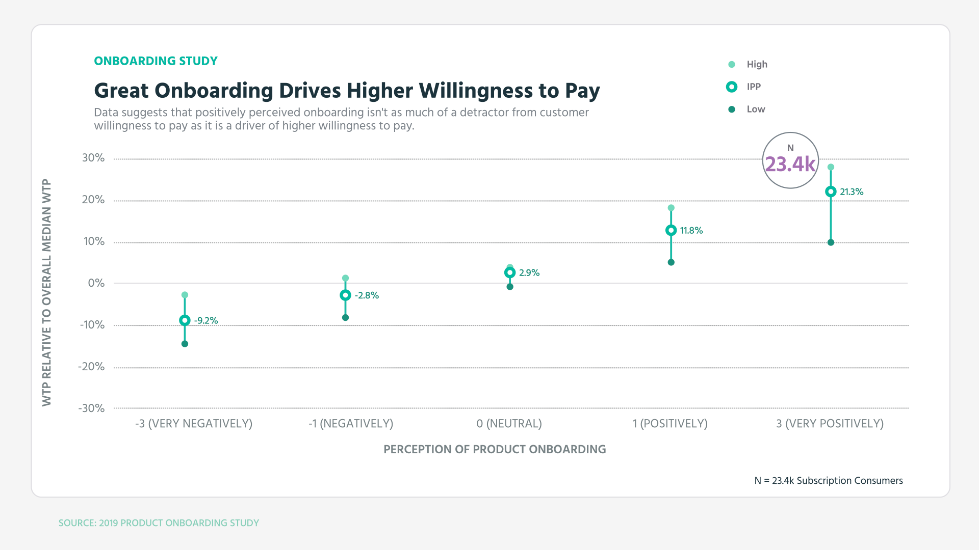
ProfitWell looked at just under 500 different software products spread between B2B and B2C and nearly twenty-five thousand customers of those products.
According to their research, customers who had a positive onboarding experience were more inclined to remain loyal to the product or service than those who did not have a good experience. In fact, those customers who perceived a company’s onboarding positively had up to 21% higher willingness to pay than the median. Those on the negative side had up to 9% drop in willingness to pay.
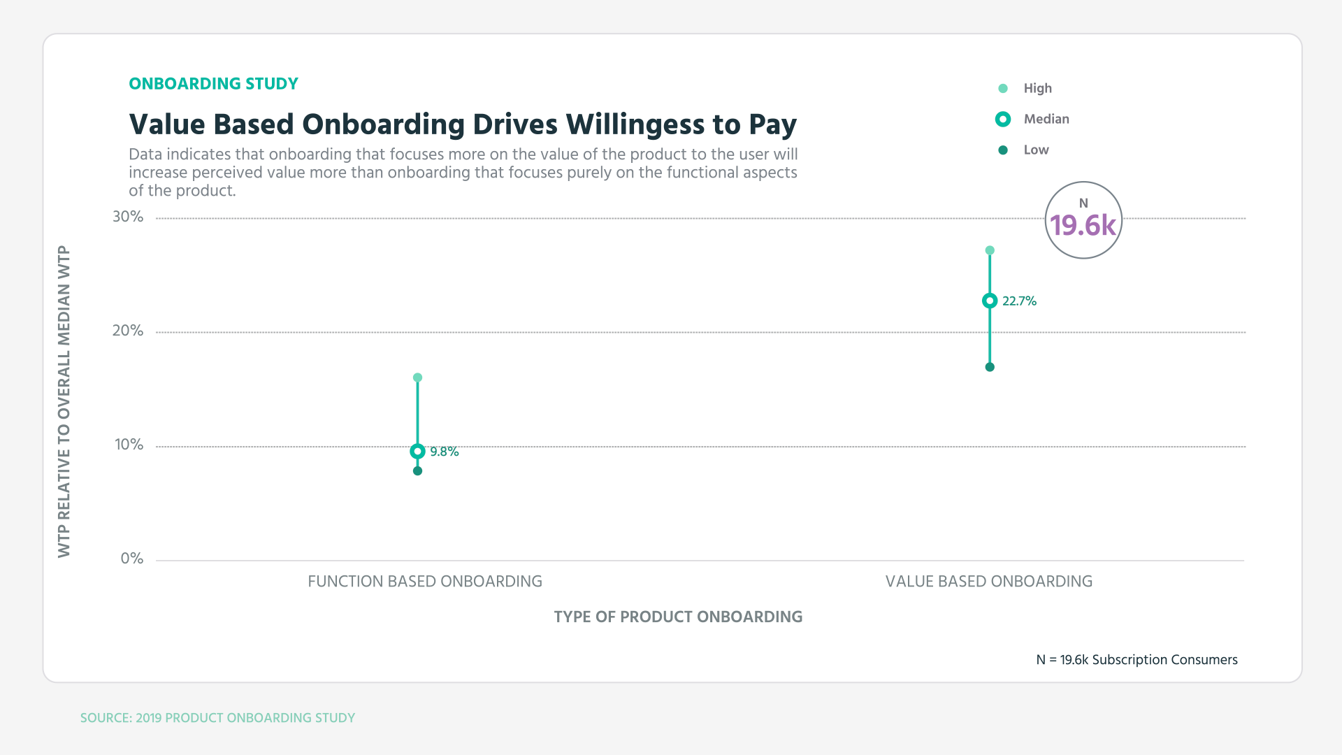
They even went a little further and explored value-based onboarding on willingness to pay. Users who experienced a purely functional but well-executed onboarding process showed an increase of 8 to 17 percent in their willingness to pay for the product. But those who received an onboarding experience that focused on delivering value in addition to functionality saw a further boost of roughly 10 percent in their willingness to pay.
Furthermore, they found that, during the first 60 days of a customer's experience, those who had positive onboarding experiences were found to have significantly fewer drop-off rates in the first 21 days compared to those who had poor perceptions of onboarding.
Another example is Hubspot. They experienced the power of effective user onboarding with their email tool for salespeople, Sidekick. After improving the "Week One" experience for new customers, they witnessed a 15% boost in retention during that critical period. This success snowballed into a remarkable 50% increase in retained users after ten weeks.
“The real growth problems start when people land...and leave. They don’t stick. This is an onboarding problem, and it’s often the biggest weakness for startups. “
- Casey Winters, Chief Product Officer at Eventbrite
2. User onboarding drives revenue
Productled did the math on this one, & the numbers don't lie!
Let's revisit the HubSpot example, where they observed a 15% increase in retention over ten weeks by improving user onboarding. How did this affect their revenue? Let's say they started with 1,000 users, each paying $5 per week without a free trial period. The total revenue generated over ten weeks would be $21,275, and assuming no change in revenue or retained users for the rest of the year after week 10, the annual revenue would be $52,775.
Now let's compare this to the scenario where they properly nurtured new customers with an improved onboarding experience. The revenue generated from Week 0 to Week 10 would be $26,425. Even more impressive is if the revenue and retained users remain unchanged for the rest of the year after Week 10. This would result in an annual revenue of $78,925, a remarkable 50% increase.
Suppose they consistently attract 1,000 new users per week for the rest of the year. In that case, the improved user onboarding experience could result in a massive 49% increase in monthly recurring revenue (MRR)! As you can see, even minor improvements in treating new customers well can lead to significant growth. Additionally, those who have a positive onboarding experience are more willing to pay.
I could go on more details on how positive onboarding experiences impact growth on the short, medium and long term. But I'll let you do some personal research as numerous studies have been done about this subject. Next, let's explore a real-life use case of what makes an effective onboarding experience.
Key Components for Successful Onboarding
As a general rule, an effective onboarding experience should be :
- Informative: The onboarding should offer just the right amount of information, delivering a meaningful quick win in your product—neither too much nor too little.
- Digestible: The onboarding messages are easily comprehensible to users. No need to use complicated jargon or overflow them with a series of unending tooltips.
- Timely: The onboarding is shown at the right "moments" of the user journey. Such as receiving nagging emails as they aren't based on where users are in their customer journey, or bombarding them with too much information too soon.
- Engaging & delivering on promised value: The onboarding process ignites curiosity and motivates engagement. Making sure that what ignited the curiosity in the first place (on an ad or landing page, for example) is delivered without a having value gap.
- Frictionless: The onboarding experience seamlessly integrates with the core user flow in the product & maturity with the product. Simple actions, such as changing when users were required to activate their email address later on the onboarding flow, can significantly boost sign-ups.
At its core, to design for onboarding is to design a new user experience. This implies that teams with different responsibilities should come together to collaborate on creating a cohesive and effective onboarding strategy.
1. Build a cross-functional team for onboarding
This may include product designers, user researchers, developers, marketing & growth team, sales team, and customer support representatives. By working together, they can ensure that the onboarding experience is tailored to the user's needs and provides a seamless transition to the product.
Great! we now have a task force of a cross-functional team for onboarding. What should we talk about?
The next step is to define the onboarding success criteria.
2. Define onboarding success criteria
As the saying goes "You can't manage what you don't measure", another saying "Measure for success, not just for activity" is equally true.
Going without a roadmap is like building a house without a blueprint, you'll most likely end up with a flawed structure. As not all data is created equal, being able to measure your onboarding success criteria is an important stepping stone to unlock the full potential of a positive onboarding experience.
The first step is to define an onboarding success criteria, where the onboarding team can quickly evaluate, test & improve as necessary. A great starting point is to consider critical milestones is the users' onboarding journey :
- Users complete the signup process
The first step is to get users to sign-up for you product. Providing a seamless sign-up experience have been shown to significantly increase conversion rates at this stage. Although, it doesn't systematically mean high-quality prospects at this stage. For example, if you require a credit-card before starting the trial period, you will most likely get fewer but higher quality sign-ups (some estimates go up to 60% on trial-to-paid conversions vs 5% for those who don't require a credit card). - Users experience the value of a product for the first time
A second important measure of onboarding success is facilitating users in accomplishing their desired outcome in the shortest amount of time possible.
For a tool like Slack, it's about ensuring that users can start communicating with their team members and accessing the necessary channels and information seamlessly during their onboarding process. For Canva, it’s exporting or sharing a finalized design. This milestone is closely tied to a product’s Customer Job (or Jobs, for more complex products). - Users begin to use consistently
After users have completed their first desired outcome and experience the value of a product, now comes product adoption. Motivation is what got them started, but habit is what keeps them coming back. The more new users engage with a product, the higher the chances that they will stick with it in the future. for Slack, a team is not successfully onboarded until they’ve sent not one, not 100, but 2,000 messages. For early Twitter, the rule “Users who follow 30 people” was a retention and growth driver. Product adoption indicator is a strong signal for retention and a leading indicator for onboarding success.
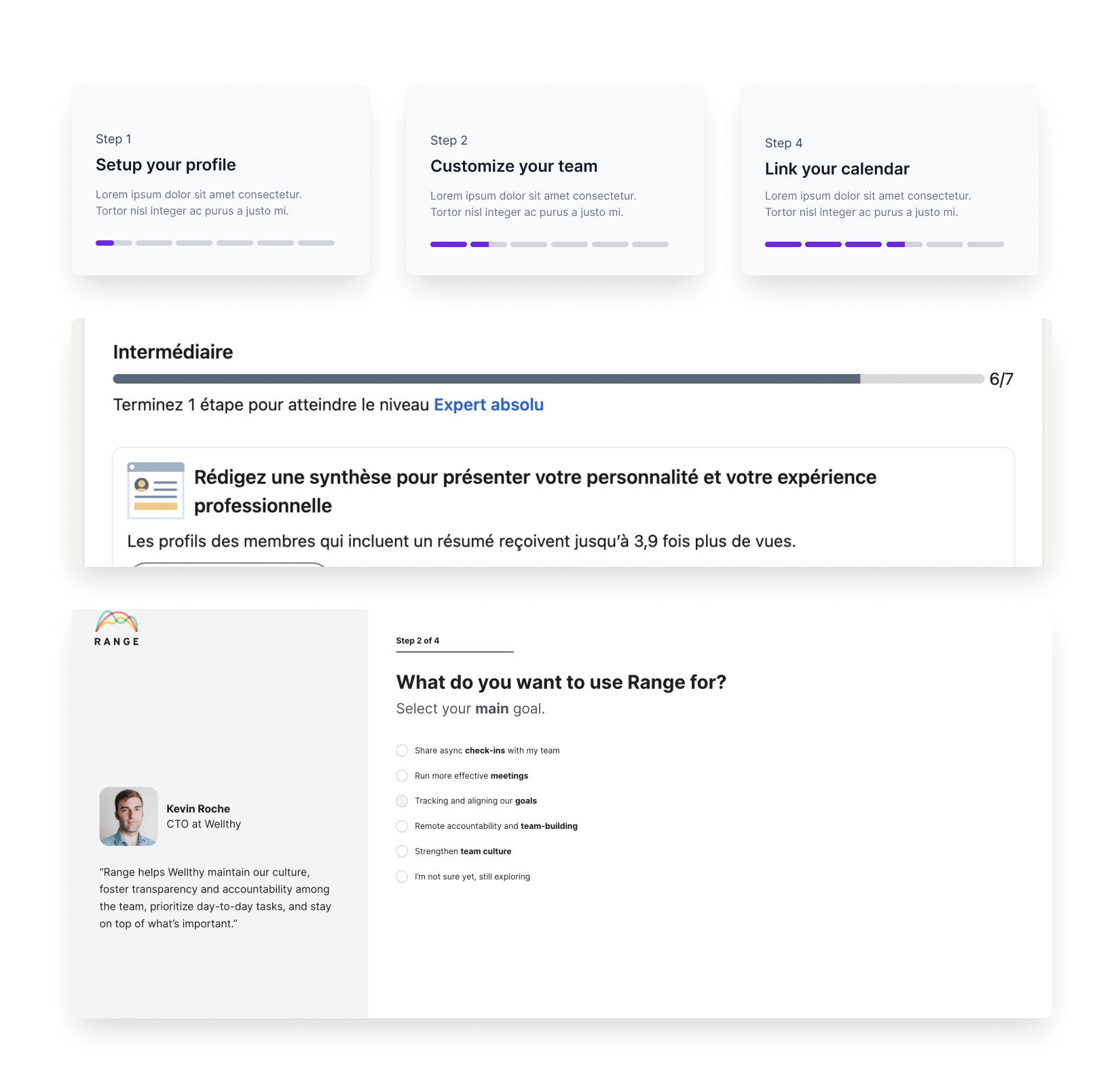
3. Define the onboarding funnel & accelerate time-to-value
By breaking down the onboarding process into steps in a funnel, it becomes easier to align the design process with the onboarding success criteria, "A-ha" moments and identify any significant events within each stage.
Mapping events earlier in the process gives a better understanding of what metrics to track and see how users move from one frame to the other. It also gives a better pathway to start identifying where you might need to send relevant onboarding emails or other conversional onboarding methods.
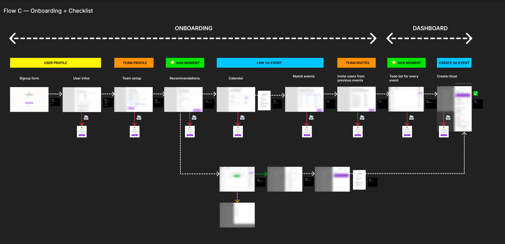
In the image shown above, we collaborated with a startup to revamp their current onboarding process. To ensure the project's success, we started by defining the success criteria and identifying the ultimate value it would bring to users. This served as a compass to guide all design decisions, allowing us to deliver on the value as quickly as possible.
Our first objective was to streamline the process by defining success criteria at this stage of onboarding and then eliminate any extraneous elements. We made a list of both "must-haves" and "nice-to-haves." The ultimate goal was to remove any "nice-to-have" components that didn't match the critical milestones and success criteria identified earlier to minimize the time it takes for users to experience the value of a product. This enabled us to focus on the essential elements of the onboarding process that would lead users towards product adoption. By doing so, we ensured that every aspect of the onboarding flow would support users in successfully adopting the product.
We then broke down the wireframes into key steps to :
- Map the user journey
- Structure a quick-win & define "aha" moments
- Identify any potential pain points or areas where users may get stuck
- Consider each steps' purpose, content, and any possible user actions.
- Get a clear picture of the wireframes
- Identify relevant metrics to the onboarding success criteria
- Determine potential onboarding emails & other in-app onboarding tools
Once everyone was onboard, we proceeded to the visual design.
4. Designing the first product experience for new users
Just as a car needs specific tools for its assembly, user onboarding requires tailored tactics and tools to drive success.
In general, these are the most common types of product onboarding tools:
- In-app experience onboarding tools (such as Appcues)
- Email and Sales onboarding tools (Customer.io)
- Analytics onboarding tools (Segment, Mixpanel, Posthog)
- User testing onboarding tools (UserTesting, Helio)
- Customer service onboarding tools (Zendesk, LiveChat)
To make it easier to understand all the tools we can use to make our user onboarding flow better, let's split them into two types: the ones that we use inside the app, and the ones that involve talking with users.
In-App onboarding tools
In-App Onboarding Tools assist users in adopting and becoming familiar with the product within the application itself. The most common ones are :
- Product Tours
A product tour is a guided walkthrough of a product's features and functionalities that help users understand how to use the product. The purpose of a product tour is to introduce new users to the product, demonstrate how to use it, and highlight its key benefits and features. It can help users get started with the product and increase their chances of successful adoption.
But This is not a one-size-fits all model.
Using a product tour step is essential for complex products that have various features to accomplish different tasks. However simple consumer applications might be able to get away without using a product tour step.
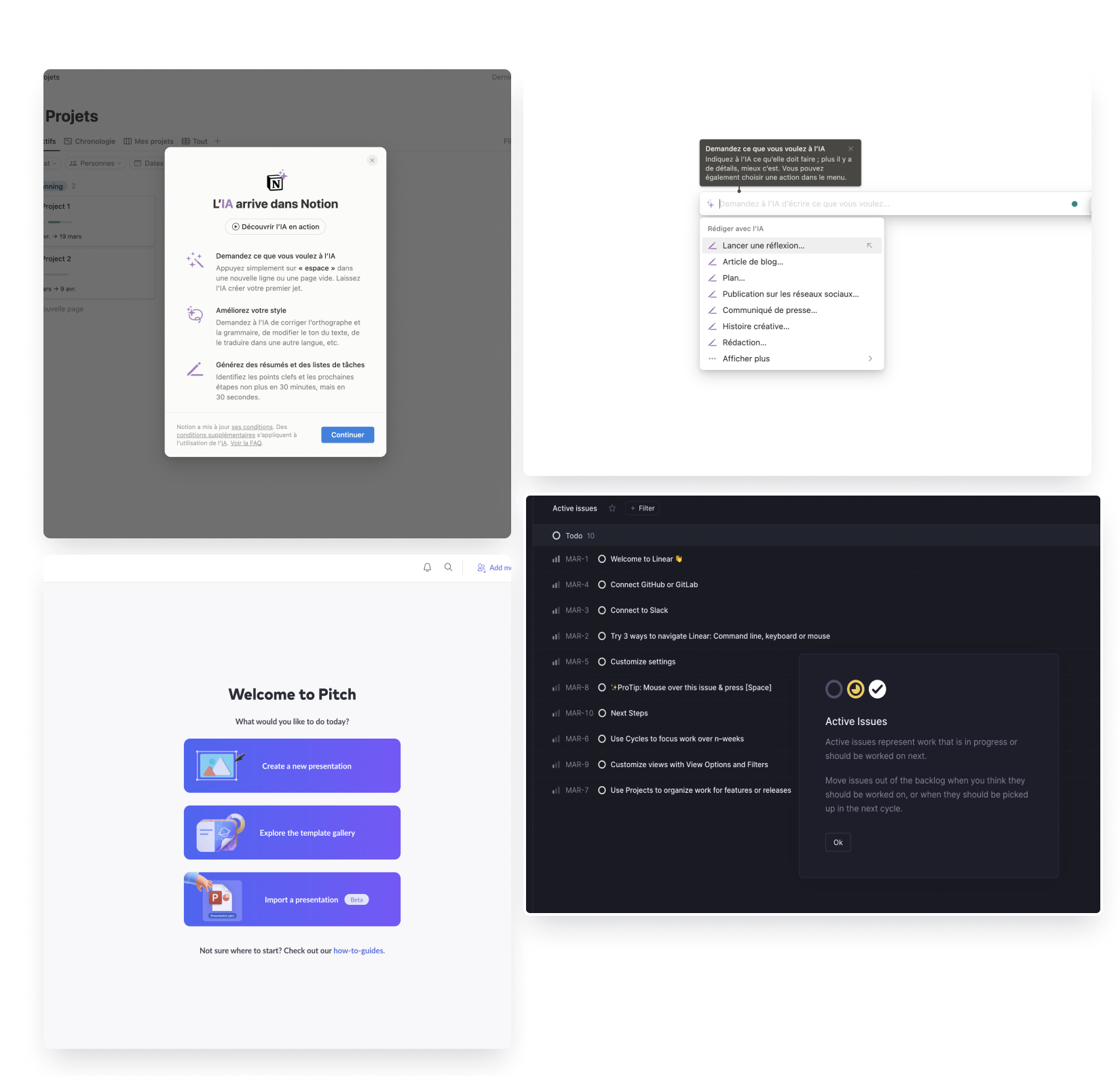
Notion recently introduced it's new AI with a simple product tour to help users get familiar with it's capabilities (quicker time-to-value). Linear guides users to better understand the app & its shortcuts, & they also cleverly present their "Killer feature" on the get-go. Pitch on the other hand starts off by identifying the main job-to-be done in the product.
When structuring product tour, it's important to consider what users or segments of users are trying to accomplish within the product & what are the first steps the users need to take in order to get value. Product tour are typically done within 2-5 steps although this might depending on the complexity of the product, but a good rule is to aim for sweet & short. Furthermore, users are less overwhelmed if they're exposed to complex features later.
According to the progressive disclosure effect, an interface is easier to use when advanced features are gradually disclosed later on. During the onboarding process, it is recommended to show only the essential features of your product, and as users become familiar with them, introduce new options. This approach keeps the interface simple for new users and gradually increases the level of complexity for advanced users.
- Progress Bars
People have a natural inclination towards making progress and are often motivated to complete tasks they believe they can accomplish.
Using progress bars can be a powerful tool for harnessing the human desire for progress and achievement. When users see a progress bar that shows them how far they have come and how much further they have to go, it creates a sense of accomplishment and motivation to continue.
In product design, progress bars can be used to show users how close they are to achieving a specific goal or completing a task. This can be especially effective for products that require multiple steps to accomplish a task. A progress bar can give users a sense of satisfaction as they complete each step and move closer to their end goal.It also serves to show users how far along they are in the onboarding process and how much more they need to complete.
When linkedIn first introduced its progress bar, it was an instant success. Through research, they understood that to maintain customer loyalty, it is essential that all profiles are fully completed. To increase the completion rate, LinkedIn uses a simple but effective tool: The progress bar. As users add information to their virtual profile, they can see a progress bar filling up. Upon completing all the relevant information, members are rewarded with badges as well.
LinkedIn was able to increase the rate of full profile completion by 55%.
- Checklists
Checklist help breakdown important tasks into smaller ones.
The tactic is simple yet effective: as users complete tasks on the checklist, they feel a sense of accomplishment that motivates them to keep going and ultimately complete the entire process.
By providing users with an overview of the steps required to set up their account, you not only give them a clear understanding of the process but also increase their motivation as they are aware of how many steps are involved.
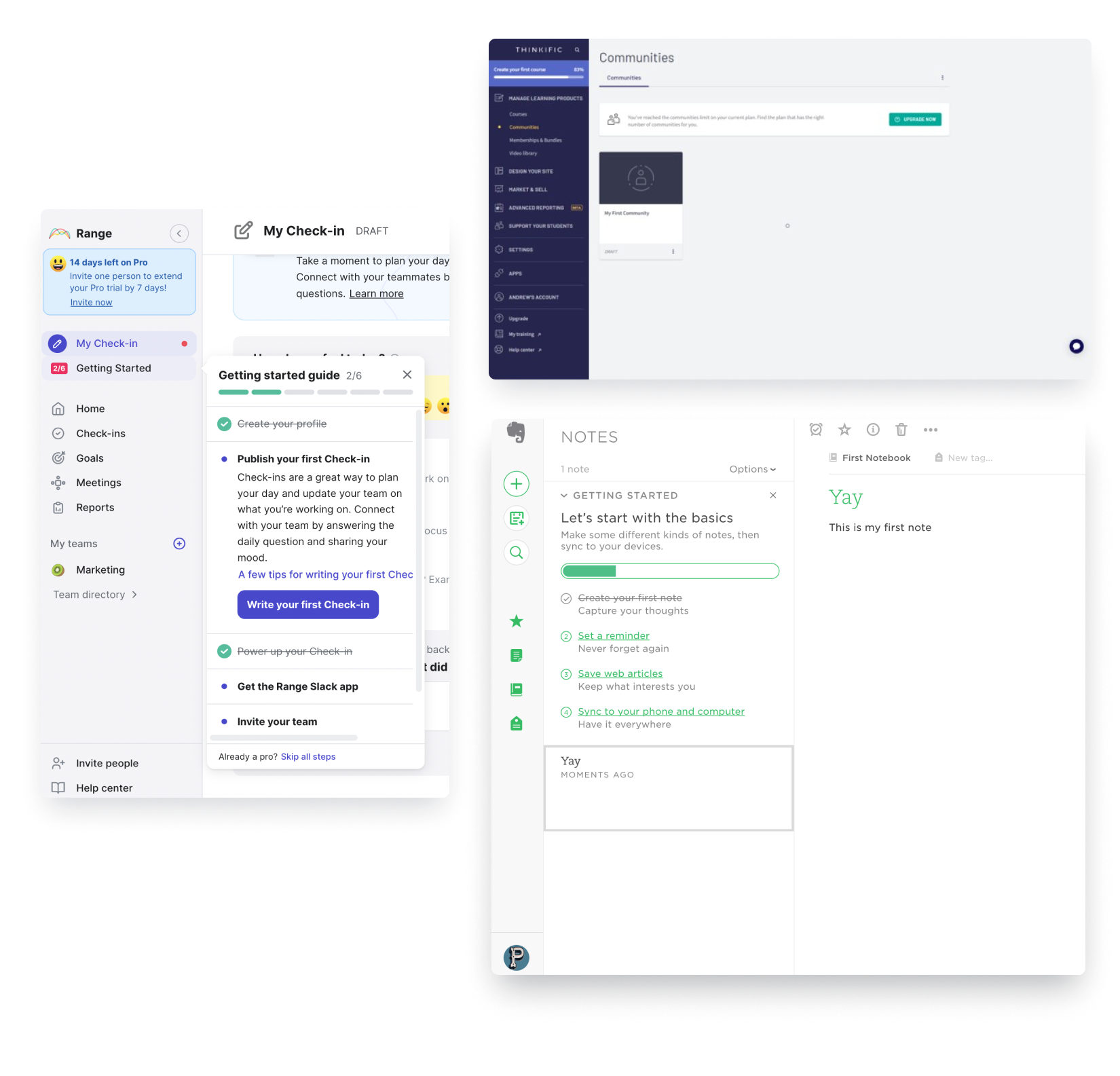
ThinkFic understood that their true activation metric enrollments. So their onboarding process is designed to help creators register at least 5 enrolled students in their first 30 days. This is because data shows that creators who achieve this goal are more likely to remain active on the platform.
To help creators achieve their objectives upon initial login, Thinkific's checklists incorporate pre-loaded educational material and represent some of the primary tasks a creator may wish to accomplish.
But that's not all. This checklist guides new users through everything they’ve seen successful early creators do & helps creators avoid some of the common pitfalls of building their first course.
Evernote begins its checklist by introducing users to its core feature, which is writing notes. Users can become familiar with the interactive step in the checklist by experimenting with the writing interface and even writing their first note, if they have something in mind.
- Onboarding Tooltips
Onboarding tooltips serve as a helpful tool to guide users on how to effectively use a product.
They provide contextual information or guidance to users by presenting a small box of text or an image when they hover over or click on a specific UI element, such as a button or icon. They can be used to:
- Help new users understand how to use the product for the first time.
- Providing useful tips to beginners, acting like a coach
- Showing existing users new functionalities or features they might not have explored yet. This is a great technique to boost customer retention.
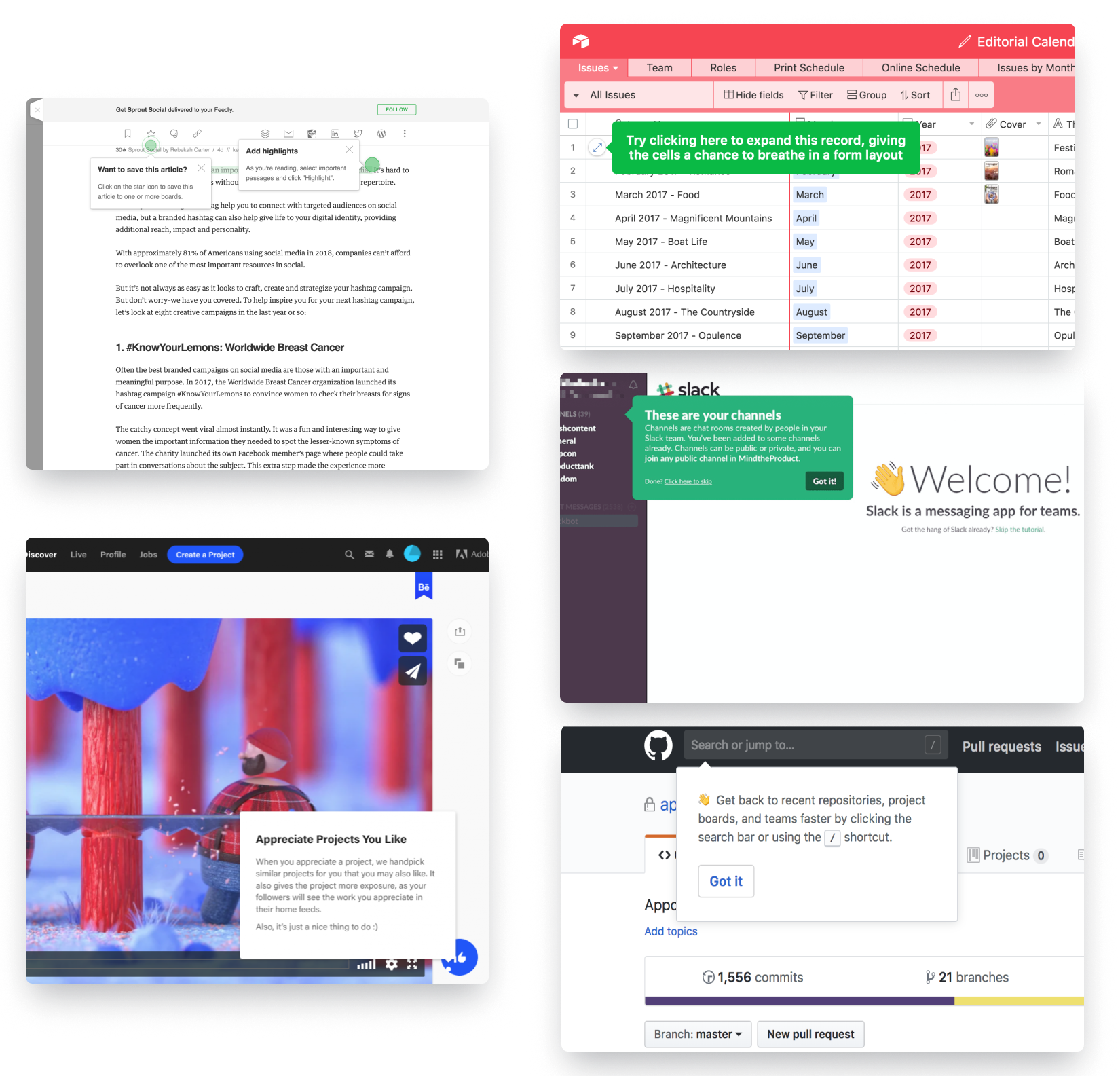
For example, Slack utilizes hotspots to facilitate a quick and easy grasp of how to use the platform. Since Slack is a product that essentially trains users on a different mode of communication, these hotspots serve as a swift training tool that effectively familiarizes users with the platform's usage.
Airtable ensures that users receive the most useful advice at the appropriate time by providing relevant tooltips in context as they navigate the app, thereby preventing information overload.
But, here's the catch. It's easy to overshare on the tooltips where it prompts you to take you through one feature after another until you've explored the entire product. This approach often leads to no meaningful value, and information overload.
Tooltips are more effective when they are laser specific on helping users achieve a key moment of value, such as a creating your first invoice with Xero or creating your first design on Canva.
- Empty States
Empty states are design elements that are used to provide guidance to users when there is no content or data available in a particular section of an application. They serve the purpose of communicating to the user what they can do next and how they can get started with the application.
Empty states also help to prevent confusion and frustration by setting the user's expectations and informing them of what they should expect to find in that area of the application. They bring some punch to another wise boring login where there isn't much to show for, yet.
Like all else, they serve as a prompt for users to take an action that will lead them towards experiencing a quick win and meaningful value in the product, just like other features and tools in onboarding mentioned.
As an example, Linear doesn't let its users start from a blank page. Instead, it cleverly offers them an easy way to get started with the app while playing with it's capabilities on the get-go. Using a simple template – that also serves as a checklist (which is also how linear organizes projects). They really went full-circle with it.
For Mailchimp, the empty state prompts users to use their "transactional email" feature where they can either try for free or subscribe to a plan.
What empty states should you include? consider this :
- What value or benefit can we provide to users in this empty state?
- What is the primary action we want users to take when they first land on an empty state?
- How can we encourage users to take action?
Conversational onboarding tools
Conversational onboarding tools serve to guide users through the onboarding process, keep them engaged with the product outside of the application and bring them back into the application, to eventually become paid members. The most common ones are :
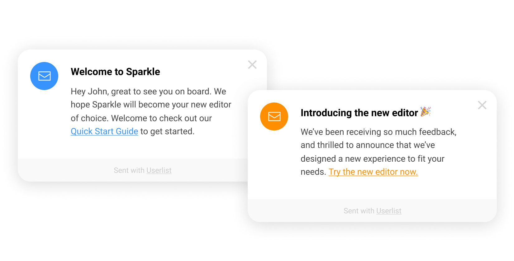
- Lifecycle emails
Lifecycle emails are a series of automated emails that are sent to a user at specific points during their journey with a product. In the context of onboarding, lifecycle emails are typically sent to new users to guide them through the onboarding process and encourage them to engage and come back to the app.
These include :
- Welcome Emails
- Usage Tips
- Sales Touches
- Usage Reviews
- Case Study
- Post-Trial Survey
- Expiry Warning / Trial Extension
- Customer Welcome Emails
The primary function of lifecycle emails is to do something your site can’t: go get your users where they are and pull them back into your app. That’s to say, if your gym members aren’t showing up, lifecycle emails drive out to their house and haul them out of bed on your behalf.
- Cutomer.io
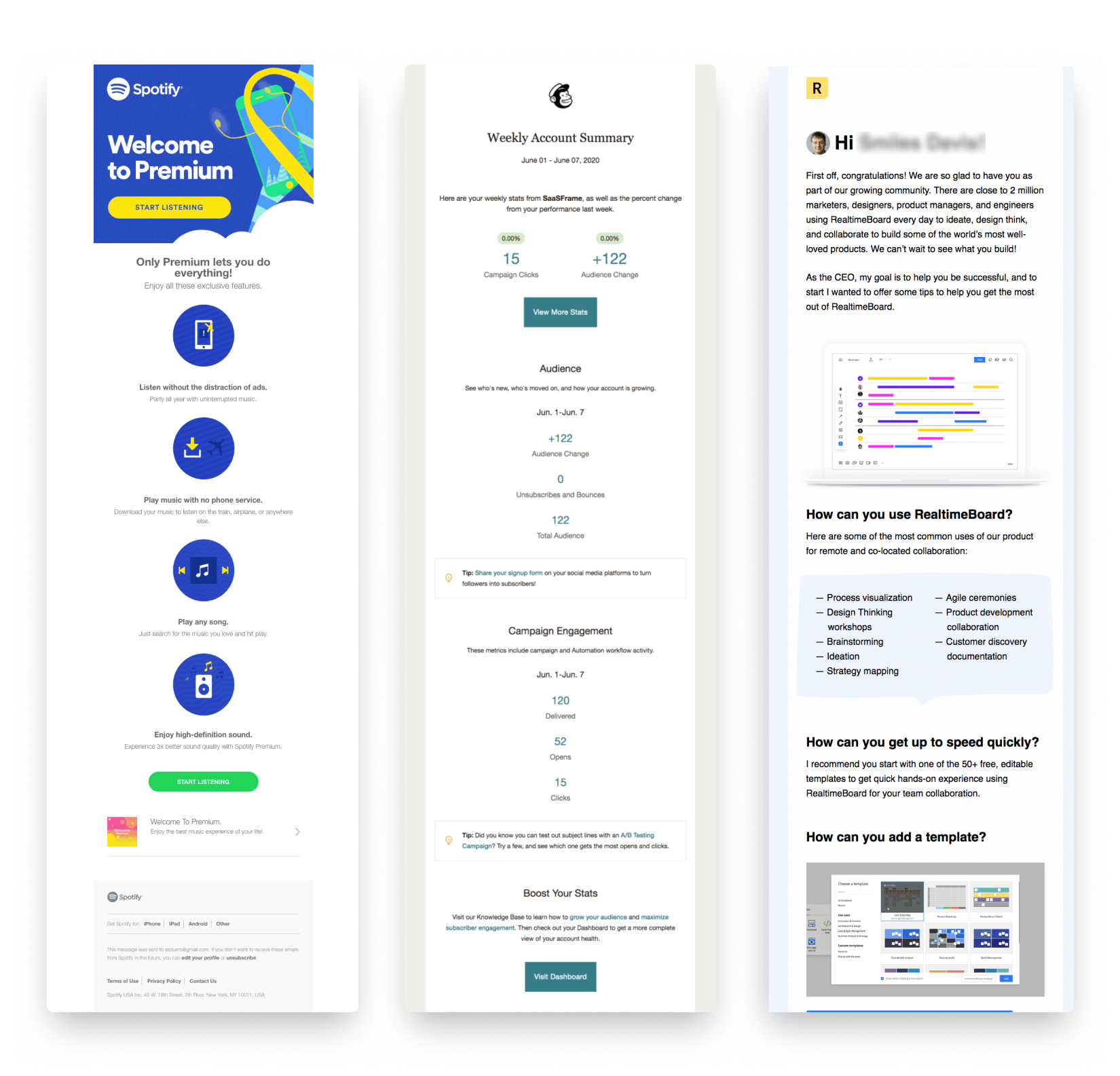
Well-crafted lifecycle emails can serve as a valuable tool for engaging with your customers outside of your app or website. By providing timely and relevant information, these emails can encourage customers to return to your product and take meaningful steps towards achieving their desired outcomes, ultimately leading to increased customer satisfaction.
But how can we provide timely and relevant information? how to AVOID sending emails devoid of personalization? The answer lies in Smart Signals and Segmentation.
This video by Wesley Bush shares how create a just-in-time user onboarding email system that can help you convert free users into paying customers.
- Push notifications
Push notifications serve to re-engage users with the app and encourage them to take specific actions that lead to the completion of the onboarding process. Push notifications can remind users to complete certain tasks, welcome them to the app, or offer them special incentives for completing onboarding.
There are several types of push notifications that can be used for onboarding purposes, including:
- Welcome messages: These push notifications are sent to new users to greet them and provide a brief introduction to the product.
- Onboarding prompts: These are designed to encourage users to complete specific onboarding tasks or take certain actions to get the most out of the product.
- Reminder messages: They are sent to users who have started but not completed the onboarding process, reminding them of the steps they need to take to fully onboard.
- Feedback requests: can be used to ask new users for feedback on their onboarding experience or the product itself.
- Feature announcements: Used to inform users about new features or updates to the product that they may be interested in exploring.
But like Tooltips, push notification use have been abused & are perceived as interruptions by many. After all, a popup, a modal window, or a tooltip appearing on a screen suddenly are bound to interrupt a person's workflow.
Sending too many push notifications too often can create a negative impression of your brand. To avoid this, there are some golden rules to follow when considering push notifications because context matters. These include : Timing them to appear in context for the user, keeping content short and to the point, segmenting recipients & setting measurable goals.
Ideally, each of the tools should work together in harmony to assist users in gaining valuable experiences from the product.